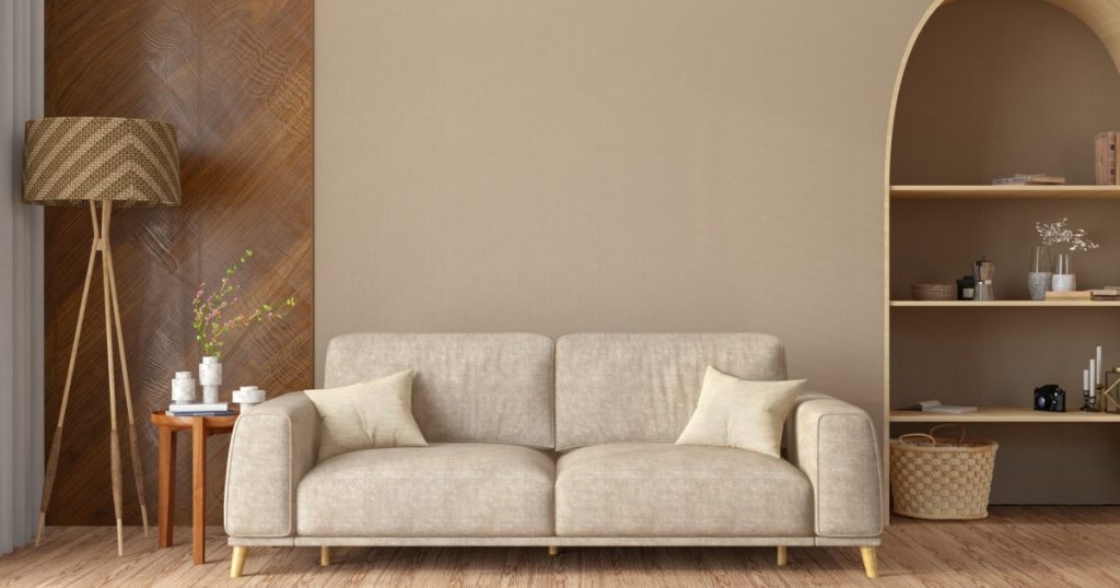
Homeowners are increasingly eschewing neutrals in favor of rich, deep colors and warm earth tones, if the biggest color trends of 2025, per Homes & Gardens, are any indication.
So, does that mean that the era of neutral is officially over, as the pendulum swings away from the cool grays, stark whites, and boring beiges that have dominated Pinterest boards in recent years?
In a word, no. The Spruce spoke with several design professionals who stated unequivocally that neutral colors will never be out of style. However, for those who are either bold-adverse or prefer a classic look, the good news is that there are ways to use neutral colors in a modern way that reflect current trends.
While Liad Schwartz, founder and principal designer of Interiors with Liad, considers himself a “designer who truly believes in the power of color,” he admits that neutrals will never be out of style. “People love them for a reason, and they provide a timeless foundation,” Schwartz explained.
The trick is choosing neutrals that reflect the current trends, such as softer neutrals or those with nature-inspired undertones. Think layered shades of greiges, pewters, and taupes.
According to Lauren Perry Design founder and principal designer Lauren Perry, the best neutrals these days “have depth and warmth.”
“A chalky white with a touch of cream or a mid-tone greige creates a backdrop that feels timeless yet dimensional,” Perry said. “What you won’t see as much anymore is the bright white, sterile kitchen; it feels too stark compared to today’s softer, cozier palette.”
Another option is to choose neutrals that have previously been considered unconventional, but now viewed as modern. To that point, look no further than Benjamin Moore’s Color of the Year, Cinnamon Slate. The hue is described as a “delicate mix of heathered plum and velvety brown” for “a nuanced color brings a smooth familiarity to any design.”
“What I try to show my clients is that neutrals don’t have to stop at beige, white, or gray,” Schwartz noted. “A deep chocolate brown or certain shades of green can function as neutrals, too. They’re versatile, grounding, and surprisingly easy to live with.”
But beyond unexpected neutrals, there are other ways to give muted colors an oomph. Using texture such as a limewash finish, a type of paint made from crushed and burned limestone, can help add visual interest and prevent the color from falling flat.
Another strategy is to use contrast to give your neutrals an added punch, but this isn’t your mother’s accent wall. A pop of deep color in your trim or strategically using bold decor and accessories can instantly elevate a room.
Finally, experts recommend color drenching, which is all the rage these days. The trendy technique creates an immersive feel by applying the same color to all of the surfaces in a room, from walls, trim, and ceilings to even furniture and floors. Not only does color drenching give a room additional depth, but it can actually make a space feel bigger.
“Even if you only paint the walls and the moldings, the room will immediately appear calmer and tidier,” Farrow & Ball brand ambassador Patrick O’Donnell told Architectural Digest. This effect is enhanced even more if you paint the ceilings—which is recommended if they’re high—the baseboards, doors, and door frames.”
“Especially in small rooms, this creates the illusion of height,” O’Donnell added.

